These are the Amazing Instagram Feed Layouts you need to try today. Your Instagram feed is the first thing that pops out when a potential customer or follower scrolls through your profile. Your Instagram needs to pop like a Lady Gaga Concert if it wants to covert avid scrollers into followers.
Think about your favourite artist’s discography and how it makes you feel, that feeling is how you should approach your Instagram feed. Understand one thing, if the feed looks inconsistent and shabby, scrollers will do likewise, they, in turn, will be unbothered.
Disruptive Advertising states that When a person opens your account a few rapid-fire decisions are made:
- Are they going to read your bio?
- Are they going to click the URL link?
- Are they going to follow you?
- Are they going to dig through your content to learn more?
- Are they going to comment or like your images?
Medium wonderfully puts forward the notion that, when we discover an Instagram account, the first thing we do is quickly scroll through it while subconsciously evaluating their bio, their number of followers, and how the grid looks. It’s a process that takes three to five seconds, and it goes something like this:
In a nutshell, these are the different types of Amazing Instagram Feed Layouts.
-
Squares
-
Diagonal
-
Tiles/chessboard
-
Rows/Horizontal
-
Columns/Vertical
-
Borders
-
Puzzle
-
Rainbow
-
Mix
Squares
Square grid layouts are easy to achieve and incorporate into your feed.
All you do is:
- post one square at a time
- Use the same filter and colour combination
- Don’t stress about how the images piece together
- Just be consistent with the colour scheme you choose


We love the Minimalist style and Suepryke because they have used a white aesthetic which is a consistent visual theme throughout. This effect ultimately helps them feature their products in a crisp and clean way. You need to establish your brand’s visual theme to have a clear feed like the above feeds.
Ask yourself:
- What colours represent or describe my brand?
- How will my customers feel about this aesthetic?
- Is it clear enough?
Tiles/checkered board
This type of layout mimics a chessboard.
All you do is:
- Firstly share a photo
- Secondly share a quote
- Third another photo
- Fourth another quote
- use a consistent font and background in your quotes.
- You can alternate colour backgrounds, photography filters or black and white photography with a coloured background


Humoroushomemaking, depressedphrases, thesaltpacket and themoneysavingmom all have amazing chessboard layouts. You can see that by using quotes, filters or colours they create this Instagram grid layout. Followers know what’s next with this feed as it is consistent and easy to follow. Use a quote for every other photo or utilize a similar colour and filter for every other Instagram photo post.
Ask yourself:
- does the background colour showcase my messages clearly especially the quoted ones and does it achieve a checkered effect.
- Is my feed coherent and how does it look and feel.
Diagonal
With this feed, simply put you’re featuring images with similar visual aesthetic or objects in diagonal lines. It is very similar to the chessboard layout.
All you do is:
- Post a similar photo every fourth post (includes the photo you want to post to create that effect).
- Literally, all you’re doing is using sets of four to arrive at that effect.
- Pay attention to your colour backgrounds as this will make the diagonal grid pop.

Wehaveawish and lisamessenger utilise the diagonal feed brilliantly. Above we have shown how you post diagonally by using arrows to show the four pattern approach. All you do is post sets of four.
Puzzle (very tricky)
This is when you want to get professional. It’s a tricky grid. Basically, your post needs to be able to stand on its own while also fitting into the larger picture otherwise people will not click on that picture. You need a serious amount of creative planning.
All you do is:
- have a large image that’s split into 9 or 12 photos then post (remember the whole image must be visible when connected and each piece must make sense)
Look be warned this type of grid layout requires a fair share of planning. Like a lot. Don’t overuse it though.


One thing all these feeds have is that each post goes or overlaps beyond the edges to connect the other post seamlessly. You need that effect to show in your feed to enhance its beauty and focus and the following accounts do just that, Thesaltwatercollective, dimoramonsignore and vanessagomes.oficial.
Don’t do this when you use the Puzzle Layout

Image courtesy of Medium
This is irritating. Why? The individual photos will not get engagement because they are blank. It’s irritating when you see a puzzle that’s not well thought out. It has to flow and make sense. The above puzzle fails, for example, the top 3 rows are 99% blank and this is irritating. So take care when you split your photos.
Rainbow
Simply put, A rainbow feed is when the colour of your feed changes when you scroll. The rainbow grid layout is super fun, creative, and pleasing to the eye. You can use different types of colours to achieve this effect.
All you do is:
- post 3 Instagram photos in a row that are the same colour.
- alternate to the next colour.
- Use a close shade to the colour you used before (eg Red then to pink, but there are shades in between you can also try)

Sarah_peretz and nei_machado do this well, you slowly ease into the next colour you want to showcase by using a pallet.
Row by Row
This is an Instagram grid layout where you post 3 similar photos in sequence to achieve the desired objective, which is to tell a story of some sort.
All you do is:
- plan and post three consecutive posts in a row
- The 3 photos you use per row must tell a story together, One row=one story.
- The 3 photos you use per row, must have a similar colour or visual aesthetic.
- Failing to upload three images at once can throw off the order of the posts and make everything look disorderly.

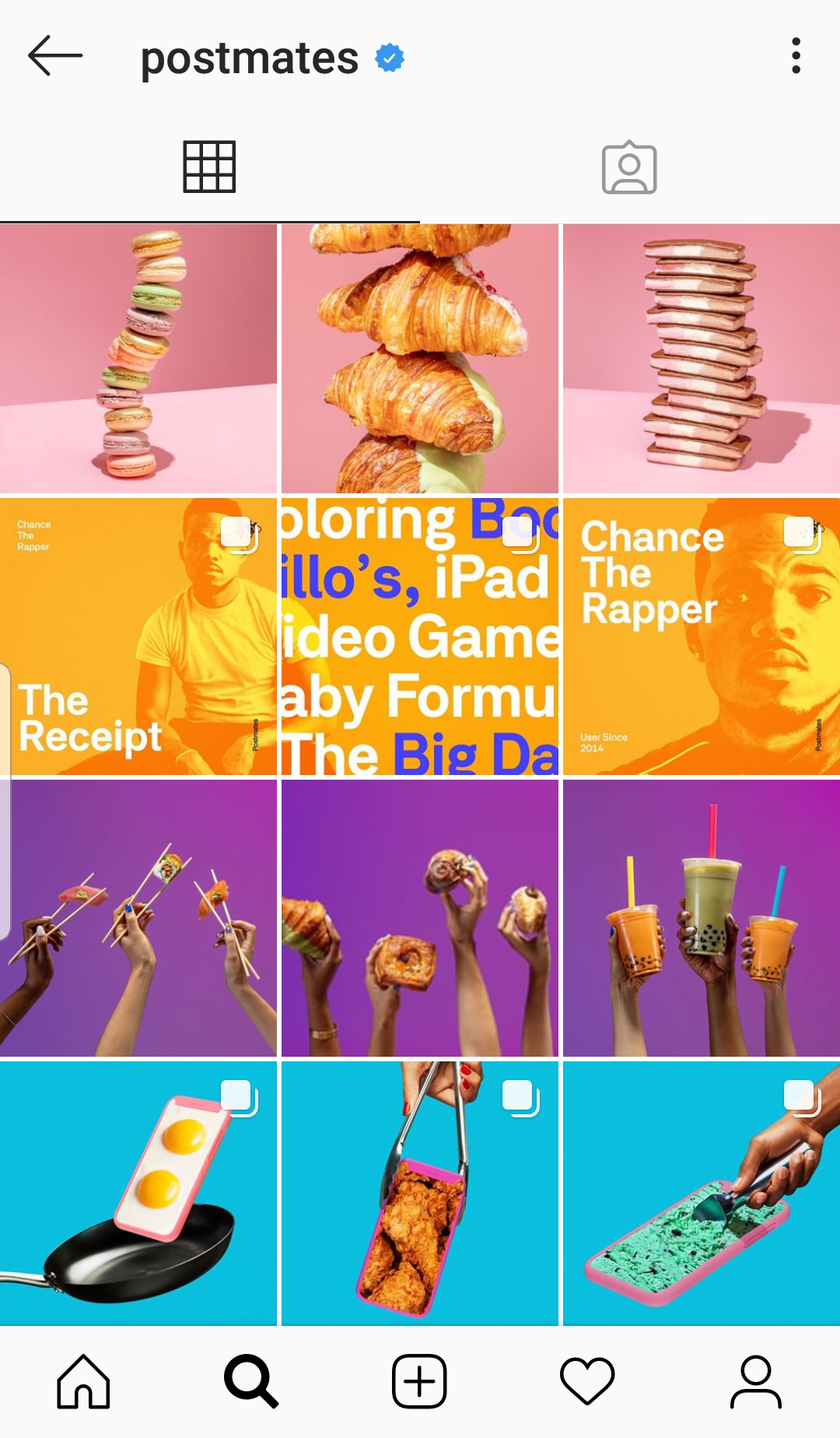
Postmates and reefstache, as seen above utilise this grid layout cleanly. They have managed to match their visual content horizontally by posting blocks of 3. Since the content is published 3 posts at a time (to prevent the layout from breaking), we recommend planning and scheduling your posts with Heropost. Below is an example

Instead of bombarding your followers with 3 posts consecutively it may be better to schedule your posts in advance. Not only does it give your followers time to digest your new post but it makes you more efficient time-wise and it gives you more time to plan your next row post. You literally can schedule a week’s worth of content which is amazing and it makes you look like a pro. On top of all that Heropost analytics will also help you figure out when best to post.
Columns/Vertical
Basically, maintain a line in the middle of your feed. We recommend using quotes on a white background however you put any colour but just maintain a visible line feed.
All you do is:
- pick 3 styles of images and post them consecutively.
- Remember as you post, your photos will shuffle across the page and ultimately you’ll see that your ‘rows’ move from left to right as you post.
- Make sure your image, have the same visual aesthetic or theme.
- This format is easy to implement because if done correctly each column should appear as a sub or sandwich with photos or graphics.
- Failing to upload three images at once can throw off the order of the posts and make everything look disorderly.

Mysimplegram and wishyouaccesories illustrate this layout well. Notice how every first, second, third, or all posts of each row, match the first, second, third, or all posts of the previous rows. Again like the row layout, instead of bombarding your followers with 3 posts consecutively it may be better to schedule your posts in advance with Heropost.
Borders
Simply put this is just applying some sort of border that appeals to you or your brand.
All you do is:
- Just add it on every photo you post
- You can add white borders can give a real sense of calmness or you can use it if it makes sense to what you want to portray
- You can add black borders if you want to make lighter colours more apparent in your photos.

 White borders make your post pop depending on what colours you use. It just depends on what makes your brand stand out. Yukastudio a jewellery business, elska.joyful.living. a natural bath and body care business, iluvplaymo a toy business illustrates how the white border actually meshes well with the products they are selling. The white border promotes the product well. The piercetwinsmum also uses this border wonderfully as the posts are consistent and flow.
Mix
Here you can just mix things up. Shifting from horizontal to vertical. Just make sure it makes total sense. Keep your feed consistent and visually aesthetic at all times otherwise your followers may get irritated.
 You can have white borders and rectangular borders and also alternate between the two borders to create a feed that stands out as seen in forrestmanskins and johnamk7 A mixed feed is great because you can pick any of the above layouts and combine them to have a scroll stopping feed.
Bright Colour layouts we love

The above feeds by ohhappyday and thecolorsofsam play with your visual senses as they effectively use colour palets that are bright and inviting. These two accounts illustrate how amazing Instagram feed layouts can be if used thoughtfully.
The Social Report listed great criteria you need to keep in mind when you Post
- Photos need to be high-quality: no one wants to see pixelated images on an Instagram grid, so make sure your photos are crisp and clean.
- You must use a similar theme: this is simple, you want to keep your photos consistent. Choose if you want your grid to be minimal, grungy, colourful, or any other aesthetic you can think of.
- Use the same filters: use the same filter on every post. This makes your posts recognizable and consistent and starts a theme on its own.
- Use a set colour scheme: decide on a colour scheme you’ll use for all of your posts.
- Keep the backgrounds clean: don’t take away from the subject of your photo—stick to solid backgrounds when posting product shots.
- Photos use the same borders (or don’t use them at all): this makes for a streamlined look on your grid that makes your profile feel highly polished and professional.
- There’s a set grid layout: alternate filters, types of content, or even colours regularly. This makes your grid look good, creates a nice “flow” between posts, and keeps things consistent.
Amazing Instagram Feed Layouts are vital for your Instagram growth. You must try out a specific Instagram feed layout to elevate your social media presence. Using an Amazing Instagram feed layout on your profile may increase your engagement and the Instagram algorithm always likes this. So try out the above layouts to create a scroll stopping feed.
We hope you enjoyed this information on the Amazing Instagram Feed Layouts you can try in 2020 to shake up your feed.
[divider line_type=”No Line” custom_height=”25″][/vc_column][/vc_row][vc_row type=”full_width_background” full_screen_row_position=”middle” column_margin=”default” scene_position=”center” text_color=”dark” text_align=”left” top_padding=”60″ overlay_strength=”0.3″ enable_shape_divider=”true” shape_divider_color=”#ffffff” shape_divider_position=”top” shape_divider_height=”80″ bg_image_animation=”none” shape_type=”curve”][vc_column column_padding=”no-extra-padding” column_padding_position=”all” background_color_opacity=”1″ background_hover_color_opacity=”1″ font_color=”#ffffff” column_link_target=”_self” column_shadow=”none” column_border_radius=”none” width=”1/1″ tablet_width_inherit=”default” tablet_text_alignment=”default” phone_text_alignment=”default” overlay_strength=”0.3″ column_border_width=”none” column_border_style=”solid” bg_image_animation=”none” translate_y=”-50%”][vc_row_inner column_margin=”default” top_padding=”5%” translate_y=”-50%” text_align=”left”][vc_column_inner column_padding=”padding-5-percent” column_padding_position=”all” centered_text=”true” background_color=”#ff1053″ background_color_opacity=”1″ background_hover_color_opacity=”1″ font_color=”#ffffff” column_shadow=”x_large_depth” column_border_radius=”20px” top_margin=”15″ column_link_target=”_self” width=”1/1″ tablet_width_inherit=”default” overlay_strength=”0.3″ column_border_width=”none” column_border_style=”solid” bg_image_animation=”none” enable_animation=”true” animation=”flip-in-vertical”][divider line_type=”No Line” custom_height=”15″][vc_custom_heading text=”Manage Your Social Media Marketing Using Heropost.” font_container=”tag:h3|text_align:center” google_fonts=”font_family:Nunito%3A300%2Cregular%2C700|font_style:700%20bold%20regular%3A700%3Anormal”][nectar_btn size=”large” open_new_tab=”true” button_style=”see-through-2″ color_override=”#ffffff” hover_color_override=”#ffffff” hover_text_color_override=”#000000″ icon_family=”none” url=”https://www.heropost.io/getstarted/” text=”Get Started” margin_top=”30″ margin_bottom=”1″][divider line_type=”No Line” custom_height=”15″][/vc_column_inner][/vc_row_inner][/vc_column][/vc_row]